


The contamination is one of the world’s leading risk factors for diseases -and then death: with air pollution alone being responsible for 9% of deaths globally, that means 5 million people.
-
Link to the publication:
-
Three examples of a local visualisation:
Agrandissement : Illustration 1


Agrandissement : Illustration 2
Agrandissement : Illustration 3

-
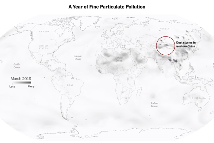
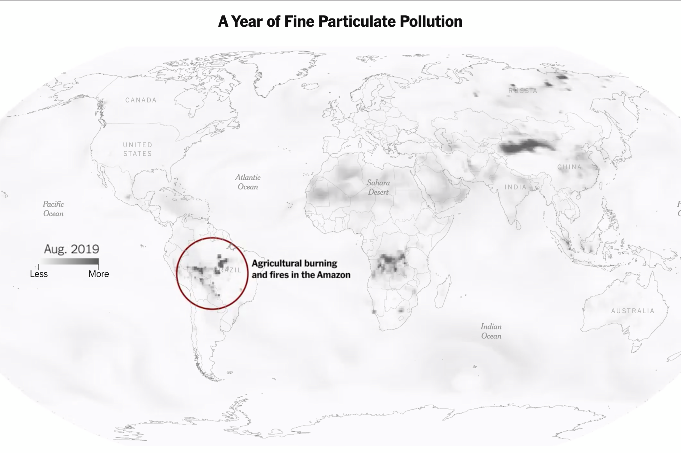
Animation for One Year of Fine Particulate Pollution in the World:
Agrandissement : Illustration 4


Agrandissement : Illustration 5
-
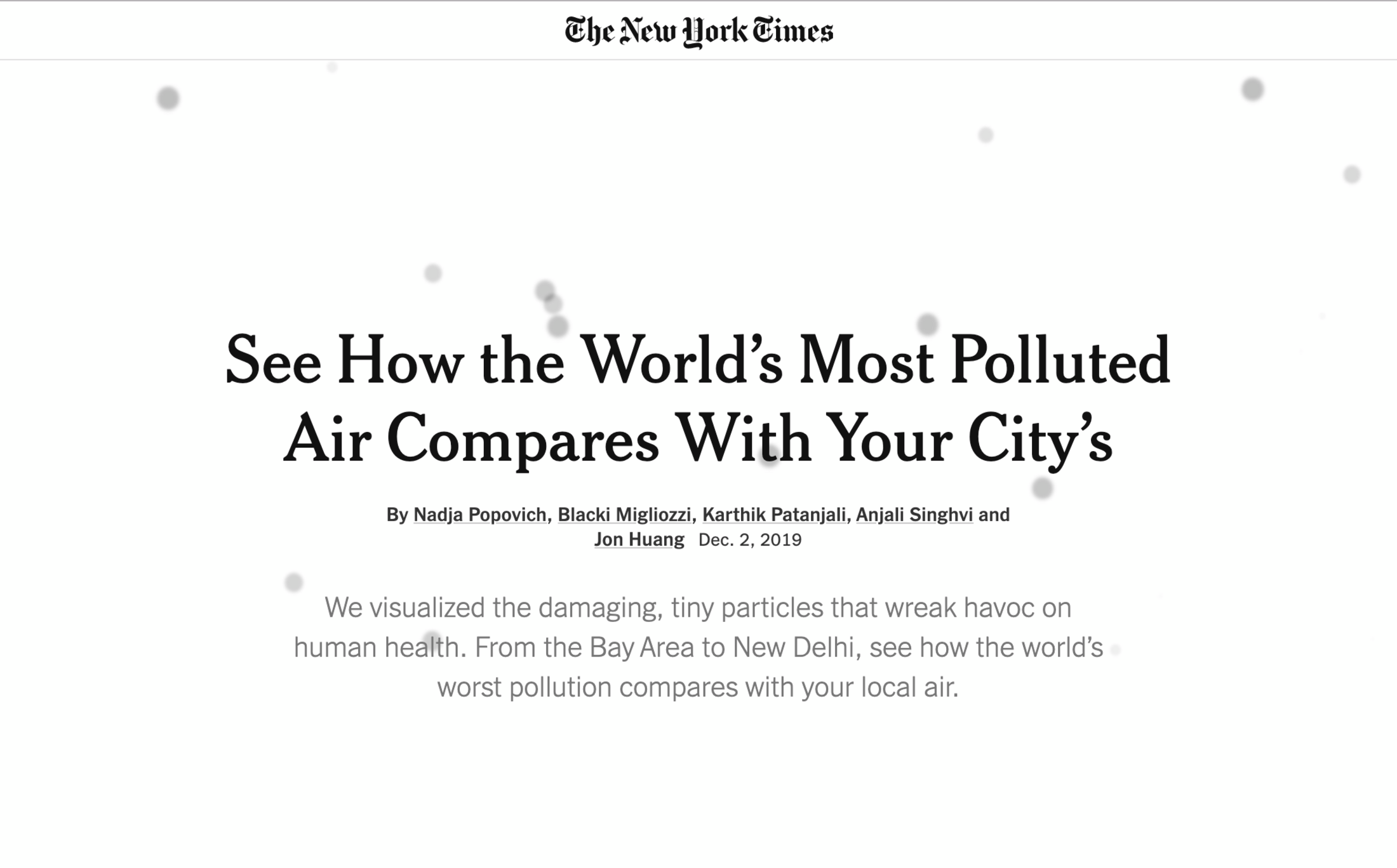
In the New York Times Education:
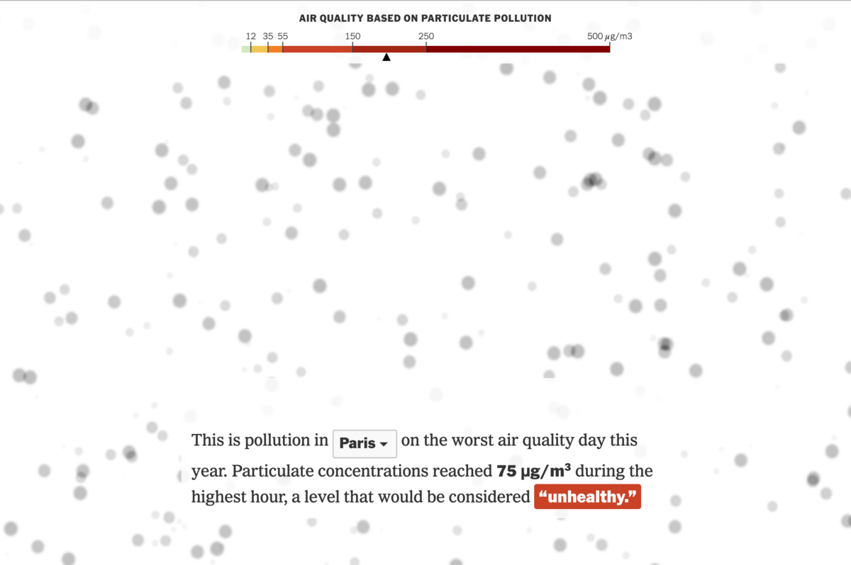
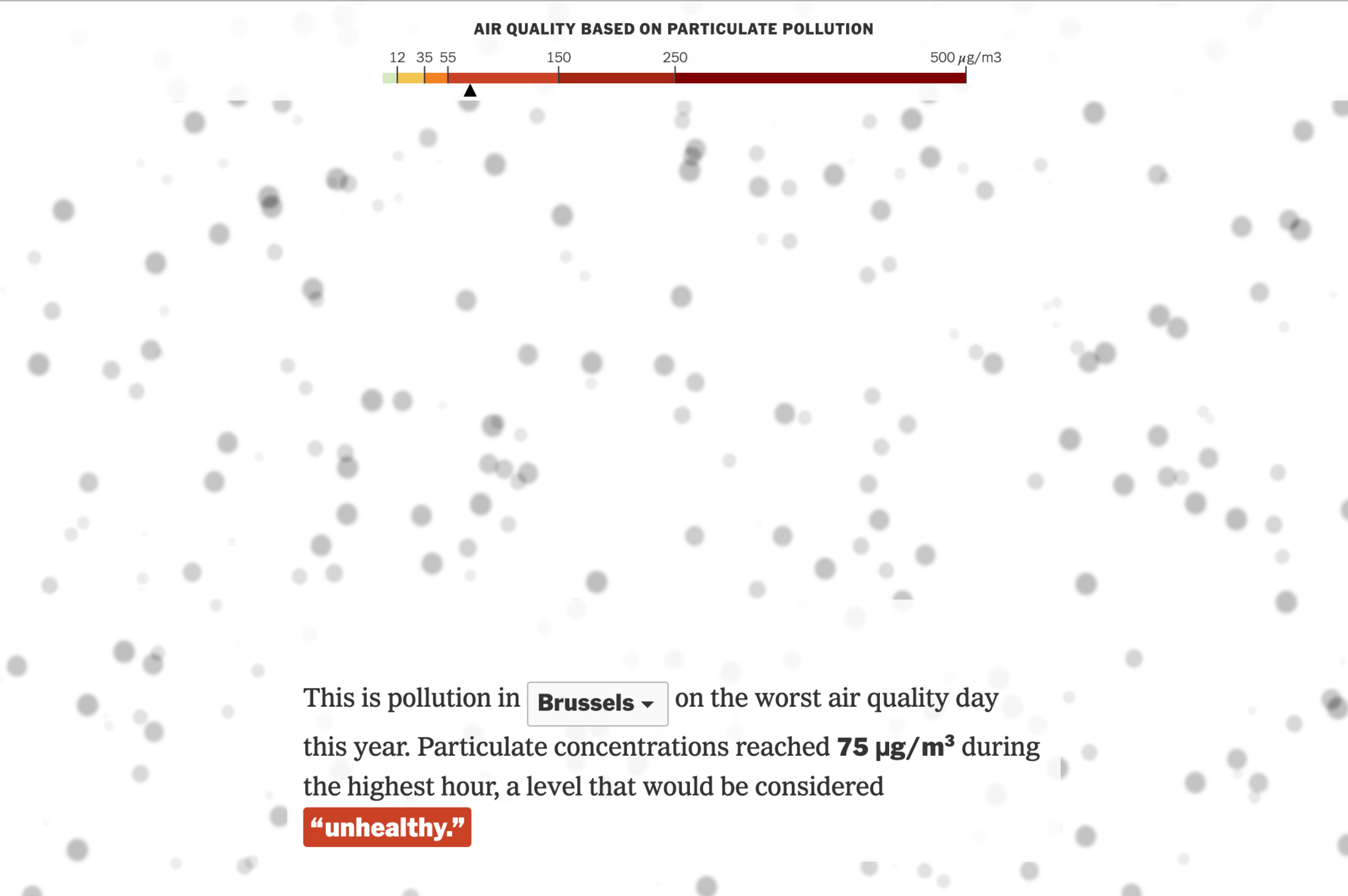
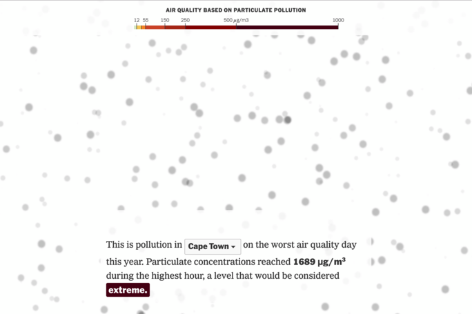
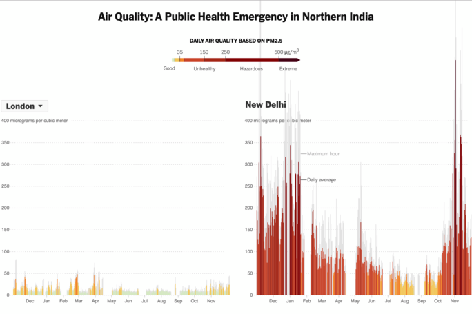
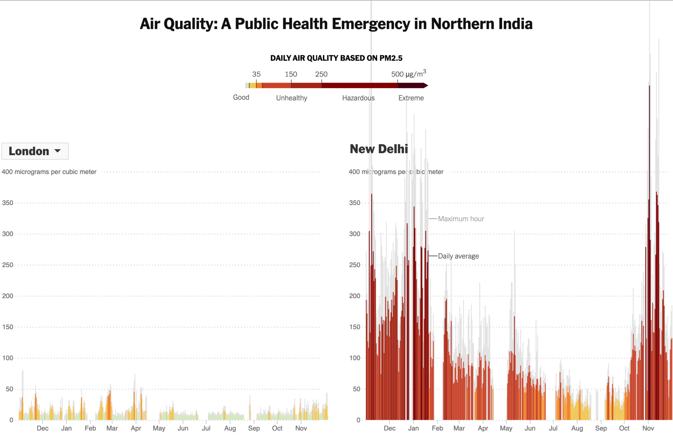
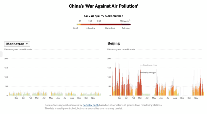
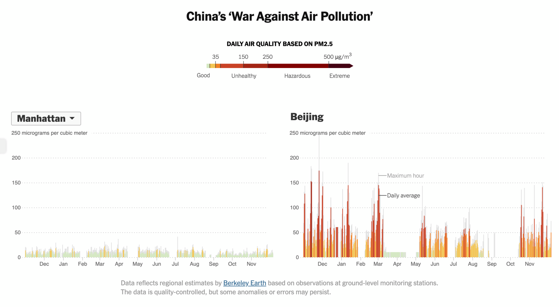
«Poor air quality poses a serious threat to the health of populations. To help illustrate the differences in air quality five experts have utilised data from from Berkeley Earth to create interactive visualisations of air quality and bar charts related to air quality over the last year by city. The article begins with three visuals of the concentration of particulates in the outdoor air going from moderate level to unhealthy level and then to an extreme level. The authors then provide statistics on morbidity and mortality associated with air pollution as well as the main factors that contribute to higher concentrations of particulates in the outdoor air. There is an interactive global map that tracks fine particulate pollution for 2019 with tags that help explain events such as the California fires that contributed to spikes in particulates. The authors go on to describe the drivers of air pollution from a socioecological perspective and explain how vulnerable populations are at greater risk. Information is provided on the impact of the fires in California as well as other aspects of climate change. New Delhi’s extreme level of particulate matter is also reviewed as well as the pros and cons of China’s efforts to curb air pollution.»
-
Agrandissement : Illustration 6
Agrandissement : Illustration 7
-
The NYT’s app is available for both iOS and Android devices.
-
Agrandissement : Illustration 8